Responsive Website Design: Why Mobile-First Matters
Imagine visiting a website on your smartphone and finding tiny text, broken layouts, or buttons that are impossible to tap. Chances are, you’ll leave within seconds. That’s exactly why responsive website design has become one of the most important factors in building a successful online presence.
Today, more than half of all internet users browse websites using mobile devices. Whether someone is searching for a local business, shopping online, or looking for services, they expect a fast, smooth, and user-friendly experience.
A mobile-first website isn’t just about looking good—it’s about improving customer satisfaction, increasing conversions, and ranking higher on search engines.
What Is Responsive Website Design?
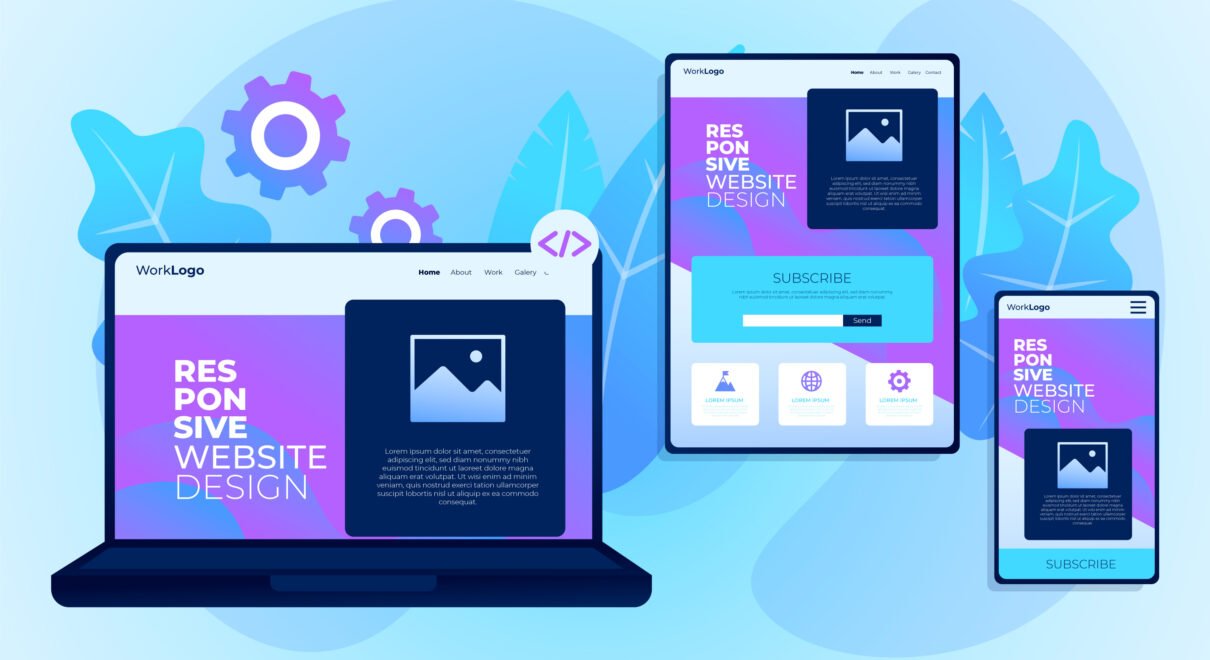
Responsive website design is a web development approach that automatically adjusts a website’s layout, images, text, and navigation according to the visitor’s screen size.
Instead of creating separate websites for desktop and mobile users, one responsive website works perfectly across:
- Smartphones
- Tablets
- Laptops
- Desktop computers
- Smart TVs
This ensures every visitor enjoys the same high-quality experience regardless of the device they use.
What Does Mobile-First Mean?
Mobile-first means designing a website for smartphones before optimizing it for larger screens.
Instead of shrinking a desktop website to fit mobile devices, developers begin with the smallest screen and progressively enhance the design for tablets and desktops.
This approach creates websites that are:
- Faster
- Cleaner
- Easier to navigate
- Better optimized for search engines
Why Mobile-First Matters
1. Most Users Browse on Mobile
Consumers increasingly rely on smartphones to search for products, compare services, and contact businesses. If your website performs poorly on mobile, you risk losing potential customers before they even learn about your business.
2. Better Google Rankings
Google primarily evaluates the mobile version of your website when determining search rankings. A responsive, mobile-friendly website has a better chance of appearing higher in search results.
A well-optimized mobile experience also improves Core Web Vitals, page speed, and usability—all of which contribute to SEO performance.
3. Improved User Experience
Visitors expect websites to load quickly and be easy to use.
Responsive websites offer:
- Easy navigation
- Readable text
- Proper spacing
- Clickable buttons
- Fast loading pages
A positive user experience encourages visitors to stay longer and engage more with your content.
4. Higher Conversion Rates
Whether your goal is generating leads, booking appointments, or selling products, a responsive website helps remove friction from the customer journey.
When forms are easy to complete and calls-to-action are simple to tap, users are more likely to take action.
5. Faster Loading Speed
Website speed directly affects user satisfaction.
Responsive websites typically use:
- Optimized images
- Efficient code
- Modern caching techniques
- Lightweight layouts
These improvements reduce loading times and keep visitors engaged.
6. Lower Bounce Rate
Users quickly leave websites that are difficult to navigate.
A responsive design keeps visitors engaged by providing:
- Smooth scrolling
- Consistent layouts
- Easy-to-read content
- Fast page transitions
Longer visit durations send positive signals to search engines.
7. Easier Website Maintenance
Managing one responsive website is much simpler than maintaining separate desktop and mobile versions.
Benefits include:
- Faster updates
- Lower maintenance costs
- Consistent branding
- Simplified SEO management
Essential Features of a Responsive Website
A professional responsive website should include:
- Mobile-friendly navigation
- Fast loading speed
- Flexible layouts
- Responsive images
- Touch-friendly buttons
- Optimized typography
- Secure HTTPS connection
- Contact forms
- Click-to-call functionality
- SEO-friendly structure
Common Mobile Design Mistakes
Avoid these common issues:
❌ Tiny text
❌ Slow-loading pages
❌ Pop-ups covering the screen
❌ Buttons placed too close together
❌ Horizontal scrolling
❌ Uncompressed images
❌ Poor navigation
Fixing these issues can significantly improve user experience and search performance.
How Responsive Design Helps Your Business
A responsive website can help your business:
- Generate more inquiries
- Increase online sales
- Improve customer trust
- Rank higher on Google
- Reduce advertising costs
- Build brand credibility
- Reach mobile customers more effectively
Whether you run a local business, an online store, or a service-based company, responsive design is no longer optional—it’s essential.